This page holds everything you need to refer to Inoku correctly: the logo files, the colours, the typefaces and a few rules. You’re welcome to use these files to write about us or to show that you work with us. The terms of use cover the details.

What the mark says
- System frame (navy, top left): the environment an agent works in.
- Return frame (green, bottom right): what comes back out of it, the record.
- Core (navy square): the claim, held between the two.
- Dotted zero: a programmer’s zero that cannot be mistaken for a letter. Precision, no ambiguity. Its ring is split on the same diagonal as the symbol: navy upper left, green lower right.
The mark explains what we care about, not how we do it.
Logo files
All files are SVG. Every path is original artwork; please don’t edit it.
| File | Use on |
|---|---|
| inoku-logo-zero-color.svg | White and light neutral backgrounds. The default. |
| inoku-logo-zero-on-dark.svg | Navy #14243C or other dark backgrounds. |
| inoku-logo-zero-mono-navy.svg | One-colour print, embossing, watermarks on light backgrounds. |
| inoku-logo-zero-mono-white.svg | One-colour use on photos or dark backgrounds where green would clash. |
| inoku-symbol-color.svg | The symbol alone, on light backgrounds: avatars, app icons, spaces under 96 px wide. |
| inoku-symbol-on-dark.svg | The symbol alone, on dark backgrounds. |
| inoku-symbol-mono-navy.svg | The symbol in one colour, on light backgrounds. |
| inoku-symbol-mono-white.svg | The symbol in one colour, on dark backgrounds or photos. |







The default social sharing image, 1200 × 630 pixels, is at /og/default.png.
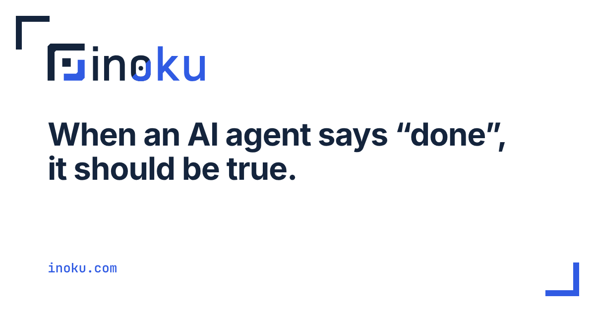
If you need another format, for example PNG at a given size or a print-ready file, ask us and we’ll export it from the originals.
Clear space and minimum size
- Clear space. Keep at least the height of the core square free on every side. That is about one quarter of the logo’s height.
- Minimum size. Full logo: 96 px wide on screen, 25 mm in print. Symbol: 16 px.
- Below 96 px wide, use the symbol alone.
Colours
Two colours carry the brand. Everything else on the site is white and light neutrals in the light theme, and a deep navy in the dark theme.
| Role | Hex | Where | Contrast |
|---|---|---|---|
| Navy | #14243C | Text and the system frame, on white | 15.6:1 on white |
| Green | #1F6F4A | Links, the return frame and primary buttons, on white and paper | 6.1:1 on white, 5.9:1 on paper |
| Green on dark | #7FC79C | Links and the return frame, on navy or the dark page background #1D1B16 | 7.4:1 on navy, 8.6:1 on #1D1B16 |
The brand green on navy reaches only 2.0:1, which is why the on-dark logo files use the lighter #7FC79C instead. The ratios were computed with the WCAG 2.x formula, and every text pairing on the site meets AA (4.5:1).
Mostly white and light neutrals. Ink carries the text. Green marks what can be clicked and the one thing per screen that matters, roughly a tenth of the visual weight.
Typefaces
- Inter for everything you read. Headings at weight 700 with tight tracking; body at 400.
- Monospace labels, code and numbers use the visitor’s own system monospace font (SF Mono, Menlo, Consolas or similar), so no second font is downloaded. JetBrains Mono, whose dotted zero is the logo’s zero, remains the brand’s monospace for print and design files.
Both are variable fonts, self-hosted on this site and licensed under the SIL Open Font License 1.1. We don’t load fonts from third-party servers, so a visit to this site makes no request to anyone but us.
Tagline
- Primary: Proof, not promises.
- Long form: When an AI agent says “done”, it should be true.
Use the primary tagline as written, with the comma and the full stop. Don’t translate it, shorten it or set it in all capitals.
Don’t
- Don’t put the colour logo on navy or any dark colour; use the on-dark file.
- Don’t recolour, stretch, rotate, outline, add shadows, or animate parts separately.
- Don’t move the symbol relative to the wordmark, or retype the wordmark in a font.
- Don’t change the diagonal split of the zero ring.
- Don’t place the logo on busy photos without a solid panel.
- Don’t use the logo to imply that Inoku endorses, certifies or has evaluated something unless we’ve said so in writing.
How to write the name
- Write Inoku in sentences, with a capital I. The lowercase “inoku” appears only in the logo.
- Product names: Inoku Verified™ for the evaluation mark and Inoku OS for the future distribution. Inoku Labs is the GitHub organisation.
- Keep the ™ on Inoku Verified™ until a trade mark is registered.
- Describe us as “an independent research lab”. Don’t call us a startup, a vendor or an AI company unless you’re quoting someone.
- Say what is built and what isn’t. Inoku Verified™ is in development; nothing is for sale today.
Press
For interviews, quotes or background, use the contact page and choose “Press”. For who we are, see About Inoku.
Licence
The logo files, colours and this page are published under Creative Commons Attribution 4.0 International (CC BY 4.0): use them to refer to Inoku, with attribution, and don’t present altered versions as the official mark. “Inoku Verified” and the Inoku name remain trade marks.